With increased international trade, the right of the citizen to an adequate diet emphasises the importance of coherent government responses to food safety and security. Under the Beijing Declaration, all signatory countries agreed to develop and operate comprehensive programmes for monitoring food safety at both the national and international level. In accordance with these objectives, the European Union (EU) spends a considerable amount on food safety. The Rapid Alert System for Food and Feed (RASFF) network involves the EU Member States, the EEA countries (Norway, Liechtenstein and Iceland), the EFTA Secretariat coordinating the input from the EEA countries, EFSA and the Commission as the manager of the system. Weekly reports of food alerts and recalls provide valuable information for immediate action but also generates comprehensive information to assess patterns and trends in the longer term.
We have developed an interactive tool (see the large button below at the bottom of the page) to enable users to rapidly access information about the patterns of reports over a wide range of parameters using user selected durations. These include: reporting countries, reported countries, extent of reporting activity and networks in reporting at the country level. The results are visualized in an interactive graph that makes all food report connections transparent at once. The interactive visualisation tool also allows user to focus on a selected country at any given time.
Due to the security restrictions of Java, two versions of the visualisation tool were deployed. The signed version has a digital signature which enables the applet to access the local hard drive in order to save visualisations and raw data when requested, but your browser will show a warning message when you try to launch it. The unsigned version is identical to the signed version in almost all respects, but it is unable to save visualisations or raw data; on the other hand, it will not trigger a warning when you launch it.
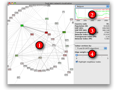
The applet consists of four major parts, which are denoted by numbers on the screenshot shown on the right. The boundary between the leftmost visualisation area and the panels on the right side can be dragged by the mouse to adjust the screen space dedicated to them.
The following paragraphs explain the various areas on the screenshot:
This area shows a graphical representation of the food alert network at a given time instance, focused on a given country. Countries are represented by rectangles. Two countries are connected by a line if at least one of them has reported on the other. (Arrowheads are not drawn due to performance reasons). The shade of the line denotes the number of reports between the two countries in either direction, darker shades correspond to more reports. More precisely, the gray level of the line is proportional to the logarithm of the number of reports between the two countries.
Every node is labelled by the ISO 3166-1 alpha-3 code of the corresponding country. Node colours are derived from the transgressor and detector indices. Shades of green represent countries with high detector and low transgressor indices, while shades of red belong to countries with low detector and high transgressor indices. Intermittent shades (e.g., brown) may be present for countries with medium detector and transgressor indices at the same time.
The network is laid out in a way that a pre-defined focus country is always shown in the center of the layout. Countries directly connected to the focus country (i.e., those that either reported on the focus country or that were reported on by the focus country) are placed on a circle around the focus country. Higher order neighbours (i.e., those that are not connected directly to the focus country but to one of the focus country's neighbours and so on) are placed on further concentric circles around the focus country; the diameter of these circles is proportional to the distance of the country from the focus country.
You can switch to a different focus country by clicking on another country; the visualisation will smoothly transform from the original layout to the new one. Hovering over a country highlights the direct neighbours of the country along with the corresponding edges and shows the name of the country in a small tooltip. Dragging a node allows you to manually rearrange the layout; the new layout will be kept until you select another country. Dragging the visualisation canvas (the area where no nodes are drawn) pans the layout. You can also zoom in and out using the scroll wheel of your mouse.
The country selector (top control on the right panel) can also be used to select the focus country manually, as it has the same effect as clicking on the corresponding node on the main visualisation.
The timeline below the country selector shows the transgressor (red) and detector (green) indices of the selected country over time from July 2004 to July 2008. Note that the Y axis of the timeline is always scaled in a way that the graphs touch the bounding box of the drawing area, therefore it cannot be used to compare the absolute value of indices between countries. However, it is useful to navigate in time to an instance where one of the indices was maximal or minimal for the focus country, as clicking on any point on the timeline adjusts the current time instance to the point you clicked on, and also adjusts the visualisation accordingly. The current time instance is indicated by a blue vertical bar on the timeline.
This area shows some basic demographic properties of the focus country and the actual numeric values of the transgressor and detector indices (computed by the PageRank and the HITS algorithm, respectively) at the current time instance.
The controls in this area can be used to reduce the visual clutter if necessary or to change different aspects of the visualisation. You can select how the nodes should be coloured; the default is based on the HITS variant of the transgressor and detector indices, but you can also select the PageRank variant or the total weight of the incoming and outgoing edges of the countries. Finally, you can disable or enable the highlighting of neighbour nodes and adjacent edges when hovering over a particular country.
Due to the security restrictions of Java, the unsigned applet cannot write files to your hard drive, hence the exporting functionality will not work in this version. See the signed version to try the exporting functionality.
We implemented a digitally signed version of the Java applet. The applet is signed by a self-signed certificate, hence your browser will show you a warning message when you try to launch the applet using the link below. Please instruct your browser to start the applet by manually accepting our certificate. If you are reluctant to accept our security certificate, please try the unsigned version of our applet, but note that the unsigned version will not be able to save visualisations and raw data to your hard drive.
Click here to open the signed applet on a new page.
Note: since visualisation-related data are always downloaded on-the-fly from our servers, you may experience a slight delay when changing the focus country or the current time instance. A yellow progress indicator will be shown on the top left corner when data are being downloaded.
Please cite this tool as:
Nepusz T, Petróczi A, Naughton DP: Network analytical tool for monitoring global food safety highlights China. PLoS ONE 4(8):e6680, 2009. doi:10.1371/journal.pone.0006680. [read the full paper]